Just a quickie: here are some of the process moments from producing the cover for Michael Chiles’ new book.
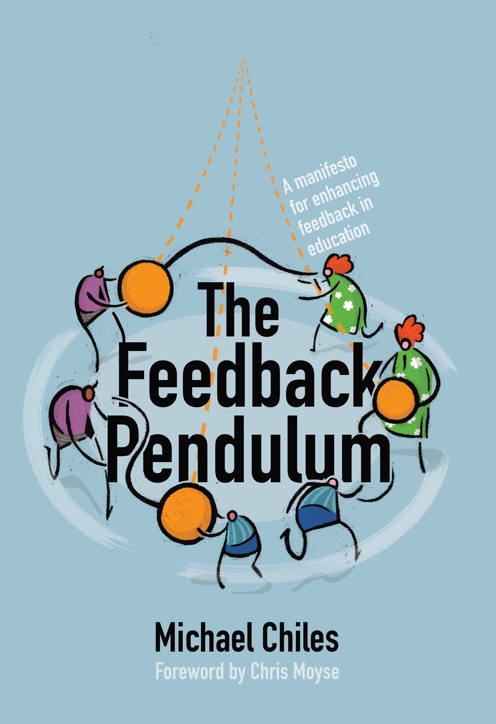
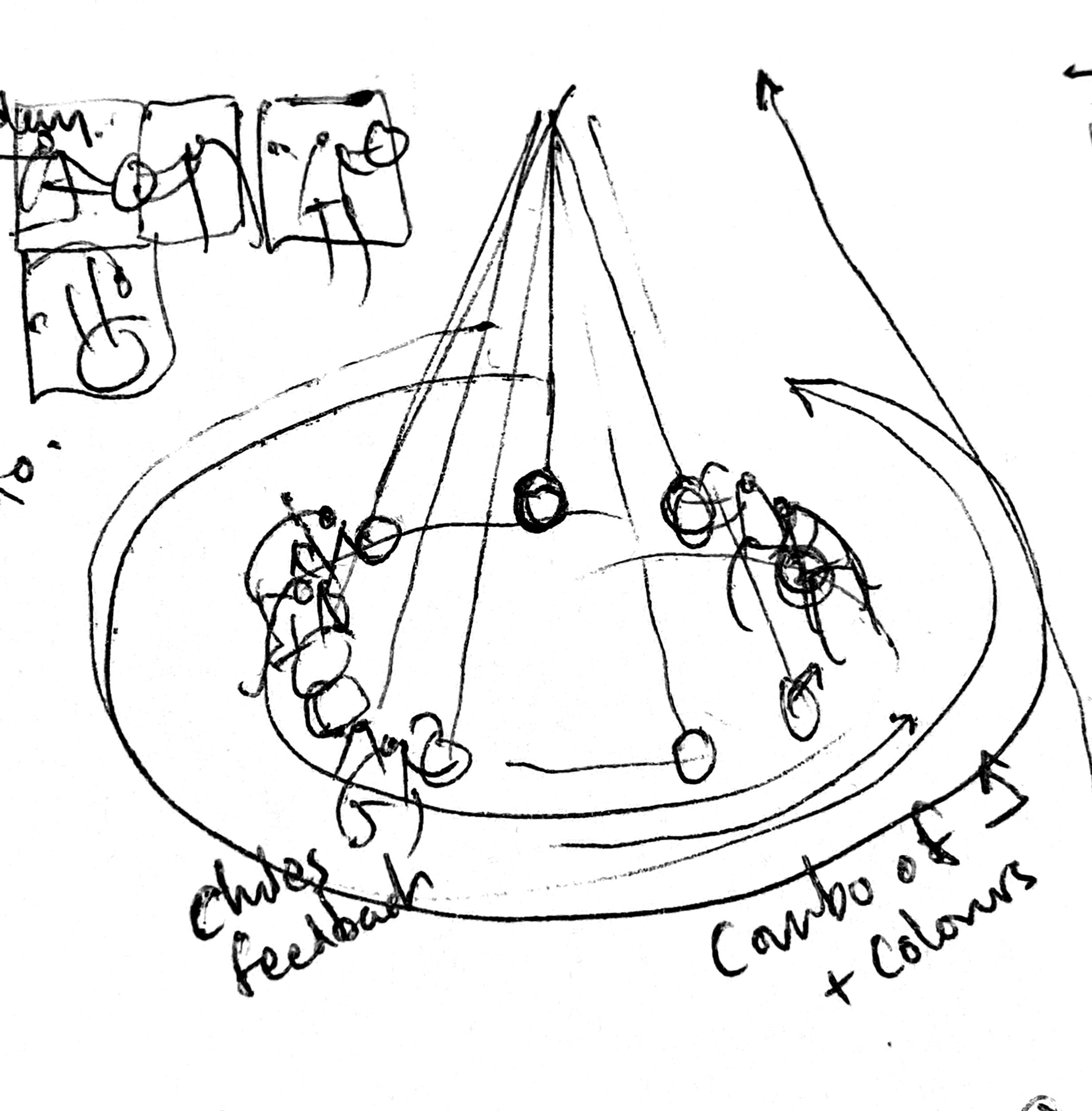
The big idea here was that educational feedback is an organic, moving thing that makes meaningful connection between teacher, parent and student perspectives. Each one has a part to play and affects the other.
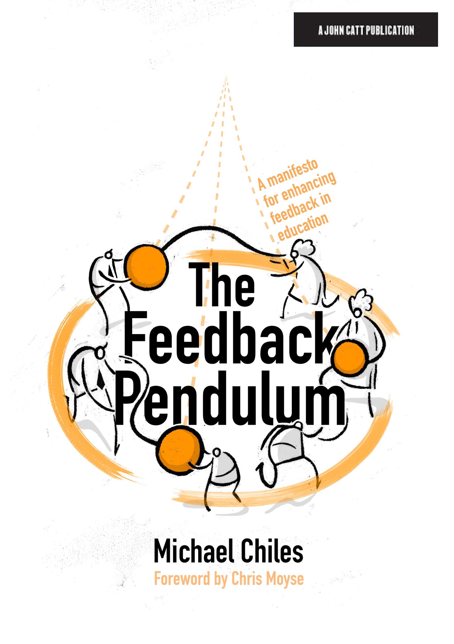
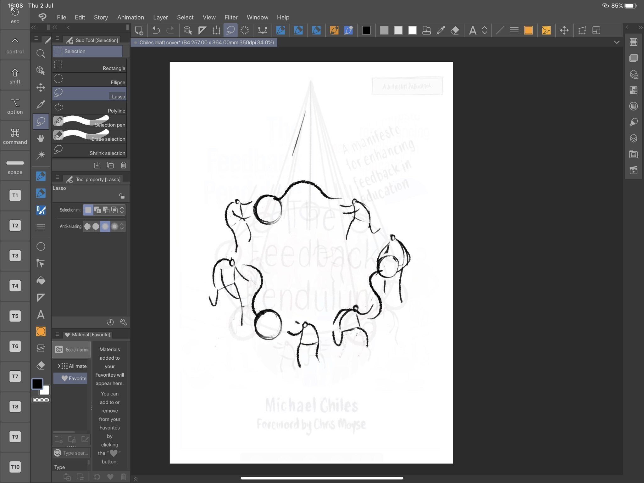
I don’t have time for a deep dive into the process (some would say this is a good thing) but it’s worth saying that my approach was to combine Clip Studio Paint and Affinity Designer. In the end producing flat vector colours is too hacky in CSP - it involves making balloons and then going through each one in a tedious fashion - waaaaay quicker to import a hi-res bitmap into Designer and work while you are thinking using a pencil tool with a fill in it.
Using a Reverse line
One other thing worth sharing is that in feeling mildly frustrated with clean flat lines I incorporated a little more of the reverse line style I have been dabbling a bit more with lately.

An example of the reverse line style from an editorial image I did a few weeks back.

Looking a bit closer…
This involves creating a rougher, less precise line (approaching linocutting in it’s approach) through drawing the inverse areas. It feels rougher somehow and brings a counterpoint to the cleaner stuff I make like this recent cover for Mark Enser’s new book.

In the end I am not sure it really notices - should I have gone a bit more all-out with it? I ran out time but the experimentation was fun.
(HT: thankyou Michael, Mark, Crown House and John Catt for involving me in your projects!)