This post is LONG! so I split it into two parts:
Part 1: learning from the Greats, not Aping them.
Part 2: Enhancing my sketchnotes using Motion
Part 2: Enhancing my sketchnotes using Motion
I wrote in an earlier blog post about how - in developing my own approach - I could either try and imitate what legends like Cognitive (and others) do, or I could learn from their example.
In my situation this means:
identifying the good that I already do - creating explainer-visuals
figure out ways to enhance this using Apple Motion
A simple slideshow
I mentioned in the first post how I converted my sketchnotes of Dave Burke’s seminar into a static slideshow that would work on Instagram as a series of panels. The feedback on this was very positive but I decided to press this further into a basic animation using the video-export function in Keynote:
This is a route I have taken many times. The tools in Keynote make it easy to create something great quickly.
Drawing everything is pretty, but can be exhausting
Over the last few years I have been developing a method for capturing drawings directly out of Procreate via the QuickTime movie capture method on my Mac. Cleaning up these assets via luma-keying in FCPX I composited the clips in Motion.
This is what I came up with:
Having produced this, I was swept up in the exciting possibility of endlessly-spiralling pen marks. In my mind something truly beautiful was appearing on the screen... so I thought I would go with it and attempt to recreate the whole of Dave’s seminar using this method. It felt like a dawn of something golden.
This is how far I got:
It took a lot longer than I anticipated and I ended up feeling bitterly resentful and tired(!) as I animated each letter being drawn (every gap between letters had to be removed to get them flowing right - yes it was tedious). To continue like this would be strategic error - I had to find a different way forwards that didn’t kill my spirit/time.
Meet Style A & Style B
Given the spiralling nature of this project, it made sense to restrict myself and define some clear styles with firm boundaries. These had to be unique to my own work and would work well with future explainer videos.
Here is what I settled on - I named them style A & B - including some of my own annotations:
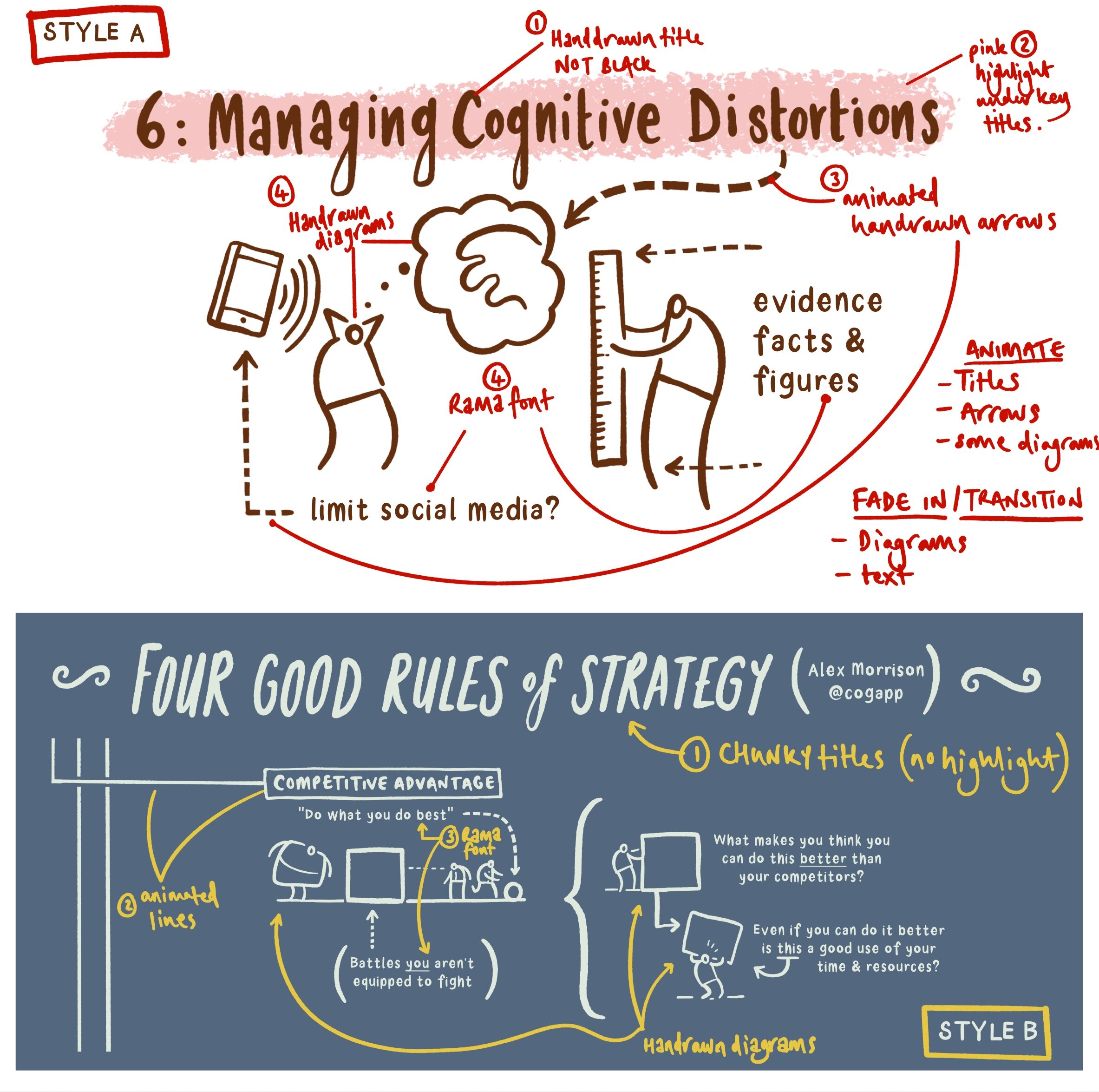
Style A is derived from the Dave Burke seminar, and style B is from an Alex Morrison blog post. From the outset I needed to agree some personal boundaries - hence using my own hand-drawn font for the majority of the text instead of the tedious animate-everything approach from before.
So I started with style B.
Style B
I am delighted with how this ended up. Fixing some clear design boundaries was a good move and led me to a sustainable style of motion graphics.
It is worth noting here the variety of assets being used - my arrows and the main title use a similar technique to the prototype ‘draw-everything’ approach outlined above. The drawings are static transparent PNG files created in Affinity Designer. Most of the text is typed in directly using my own font (such a time saver - God Bless all of you at Glyphs). Moving lines and various movements were simple to accomplish.
I should say that the camera framing was a considerable pain. I tried to use the camera framing behaviour that was helpfully promoted to me by Simon Ubsdell - unfortunately for some reason it was producing erratic and confusing results that left me a bit weary. In the end my new-found AE knowledge of keyframing gave me the confidence to do it myself - yay me! I was amazed at how easy this process turned out to be.
I used some guide boxes to help myself throughout - here is a render without them switched off so you can see how I positioned the camera:
Style A: animating static (but well-organised) transparent pngs
The problem with my style ‘B’ experimentation was that it wasn’t optimised for smaller screens with the square social media frame. This time I wanted to make sure this was built in from the start.
I created a larger 5000 x 5000 px canvas in Affinity Photo. Arranging my material into sections I decided on a general direction for my virtual camera. Here is the general composition I was going for:

I exported this directly to Procreate as a .psd file (17 layer limit!). The redrawing process was painless and very quick. Notice below the clearly labelled layers:

The resulting transparent pngs We’re a breeze to import. I then worked my way (surprisingly quickly) through the 5 minutes of Dave’s presentation in Apple Motion.
To make the process a little simpler for myself I created coloured squares throughout the whole sequence (as per my style B approach above) that represented the position of the camera. It was organisationally waaay simpler to animate the png assets first and to key frame the camera at the end. The square frame guides were a huge help. I switched them off after I had finished.

Then I exported the whole thing (it took two hours! ...although to be fair - when I made a music video in After Effects 15 years ago it took 24 hours so I didn’t mind The wait as much this time around). This proved to be a wasted render due to blurring at various points.

“What is this!? My eyes! My eyes!”
I remedied this by switching off the depth of field setting:

Everything seemed to be working quickly and efficiently, so I added a colour filter and exported the final piece:

Style A is a resounding success - it is a pretty straightforward and sustainable method for producing motion graphics for social media. Taking it further, I would export those original PNGs as separate drawing/shading layers to achieve more colour range like the original graphic (see below). Also I might consider bringing in a few of those original hand drawn elements from my labour-intensive prototype. One or two well-placed drawings can make all the difference.