This post is too LONG! so I split it into two parts:
Part 1: learning from the Greats, not Aping them.
Part 2: Enhancing my sketchnotes using Motion
Part 1: learning from the Greats, not Aping them.
If you hadn’t figured this out yet I’ll say it again: I love making explainer-visuals - especially information-rich ones. It’s a chance to lose yourself wading into something deep (and often opaque) but then to emerge with an empowering solution. Herein lies the joy of schoolteaching for me - creating ladders into powerful material that might otherwise have been too remote.

One of the frustrations with social media (or screens in general) is that a dense chart doesn’t translate so easily. My Lost Box infographic is an example of this. It was originally designed as a huge poster for a national science conference (that we won!), but when you view it on an iPhone it doesn’t have the same kind of power.
So how do you convey something like this on a smaller format?
Recently I spent a couple of hours making some visual notes for an online seminar given by Dave Burke on supporting vulnerable people during lockdown. Initially I created a series of shareable ‘moments’ and sent these to Dave as a static slideshow that could be flicked through on the small screen - like so:
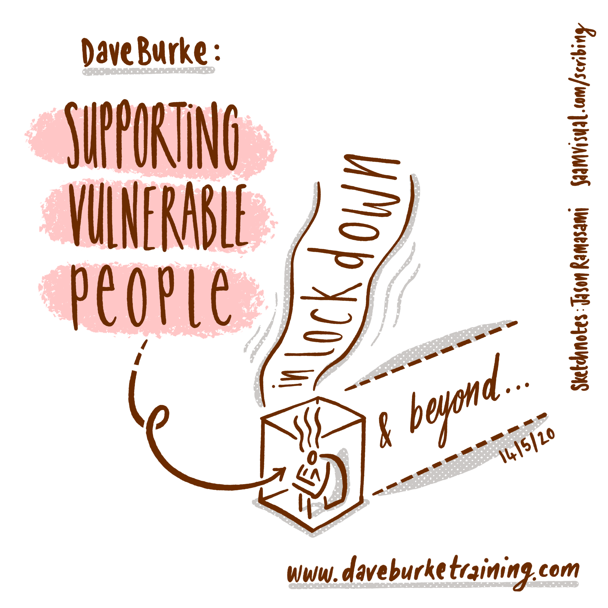

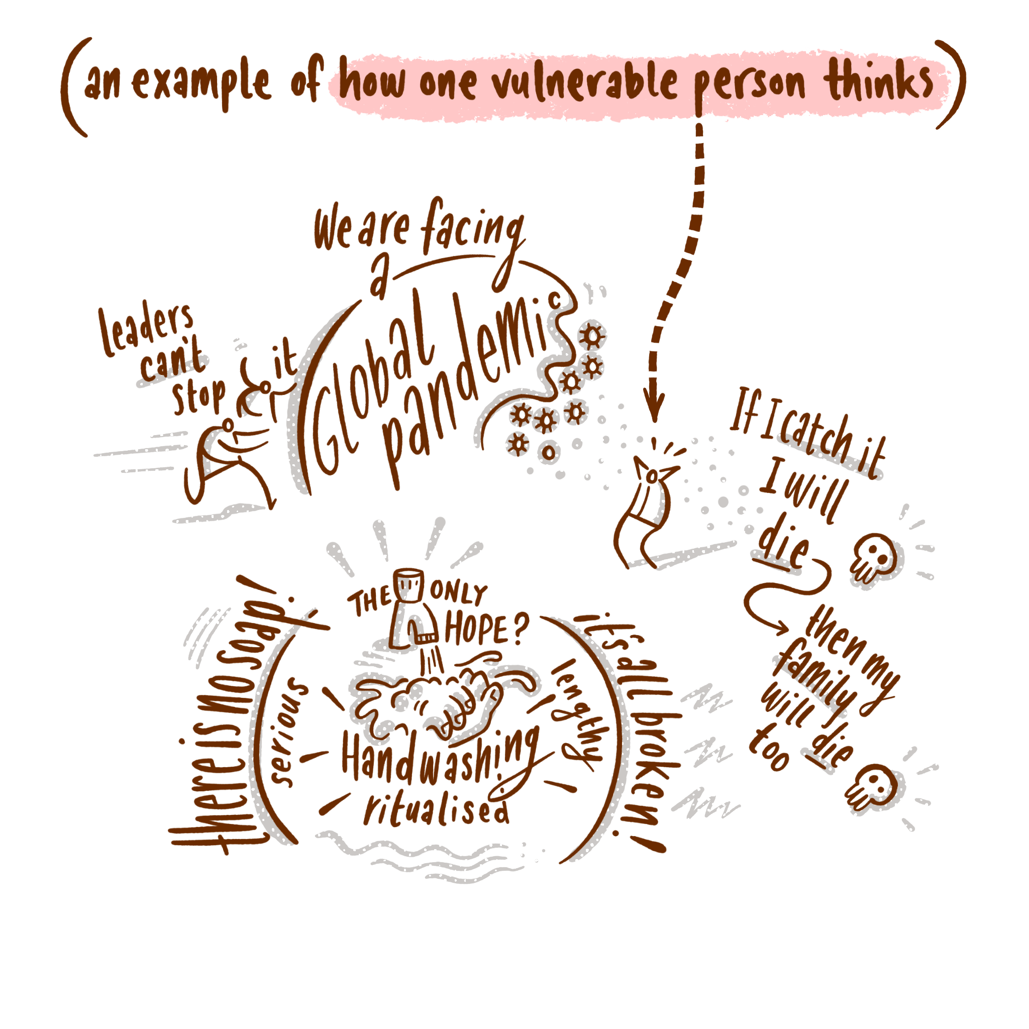
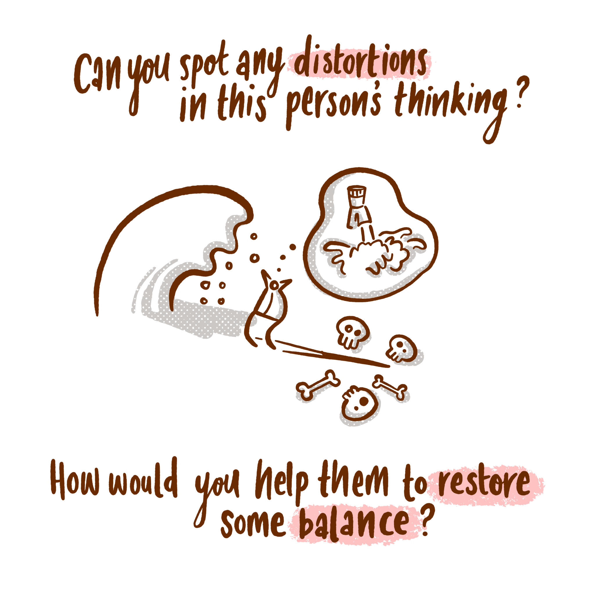
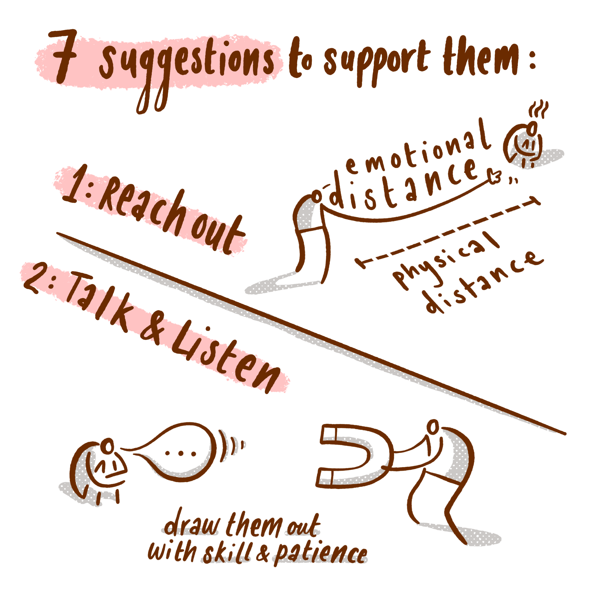
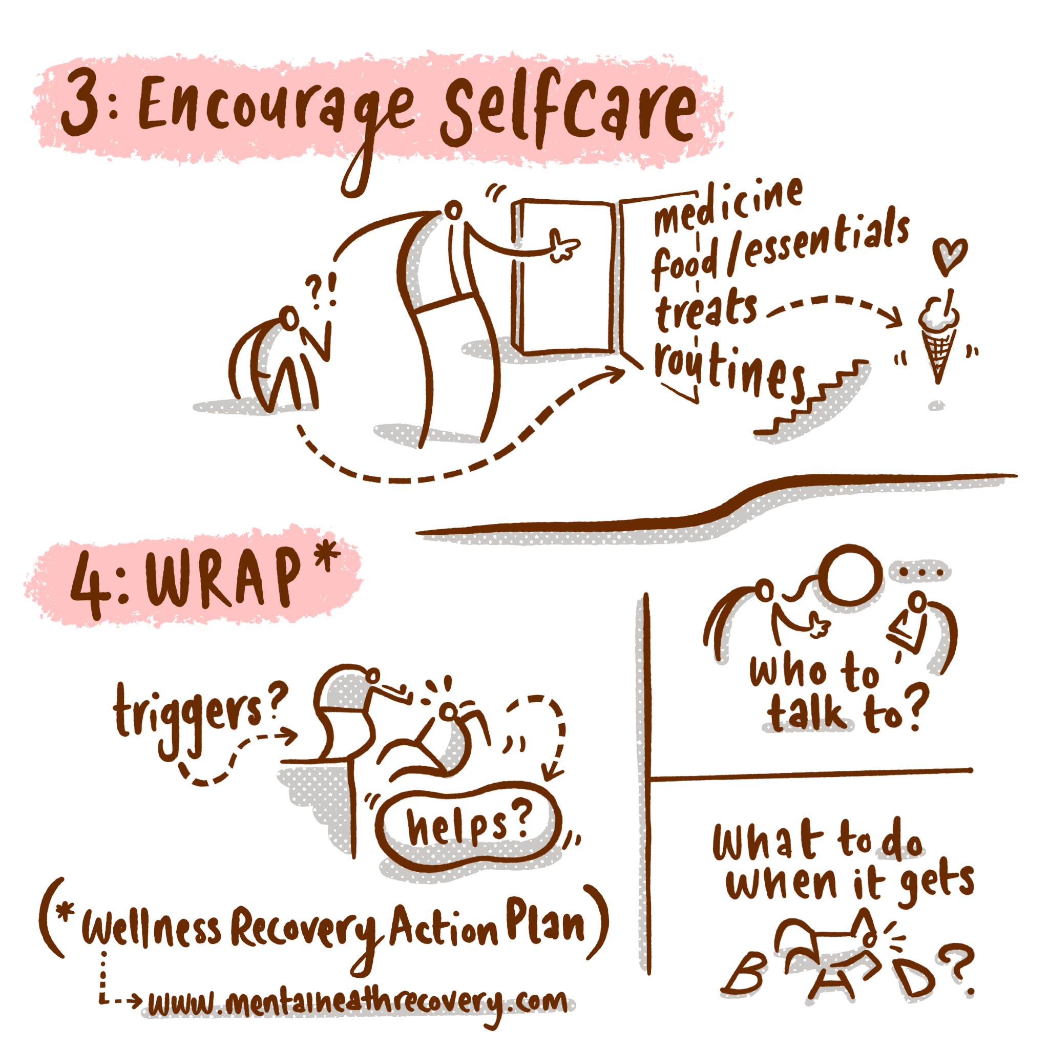

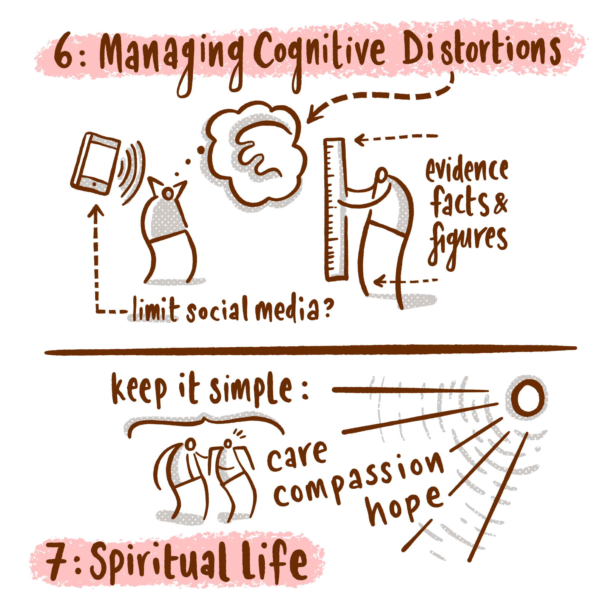

This is a quick solution to the problem of transforming material to a smaller format. Within the ten-image limit on Instagram these are great. But (and I think you can guess where I am going) I wanted to push this further into the realm of motions graphics and kinetic typography.
After (the) Effects of Instagram
During the COVID-19 home-exile-period™ I have been spending a chunk of my spare time familiarising myself with After Effects. Currently it’s not hard to be impressed by the boom of advertising agencies pushing smart animated sequences on Instagram by amazing artists like Magoz, Laurie Rowan, Ben Marriott and James Curran. In fact - it is easy to be swept up in envy when you see these seemingly effortless renderings.
The underlying truth is quite different of course - these are incredibly skilful, carefully constructed pieces of work that deserve their wide exposure. The fact that we can skim through so many for free is part of their addictive illusion. And there I was - scrolling through screen after screen - feeling the urge to change direction and copy what they do.
It took me a few weeks to realise that I was just being crushed with unrealistic fan-boy desires. Alex Morrison’s superb article on strategic thinking was really useful in refocusing my energies. It helped me to step away and ask myself what it was that I do well, and more importantly whether spending time dabbling in After Effects was going to be worth it.
What do I do well?
The answer for me was that I am good at explaining/arranging information visually, and that if I was going to devote hours to learning new tools, it would only be time well spent if it enhanced what I am already doing.

No point in using After Effects to become an imitator. I am sure there is a place for cover-bands, but I want to write my own hits.
This led me into several weeks of exploring After Effects. I took a few courses online and familiarised myself with those brilliant Ben Marriott tutorials on YouTube. In spite of this I couldn’t shake the nagging feeling that the Adobe CC ferryman¹ was going to be coming for me before I had reached the other side.
And then I re-discovered the joy of Apple Motion.
This little companion app to Final Cut Pro X had been sitting on my Mac for around ten years (a one-off £40 payment!). I had occasionally dipped into it, and then dashed out as I got frustrated with it’s lack of immediate magic. Little did I know...
It’s true that there seems to be a lot less support online for Motion - AE dominates partly because it is cross platform. Simon Ubsdell and Simple Video Making are two terrific channels that have loads of Motion stuff to dig into. Not all of it was relevant to me, but I found enough support to open up it’s usefulness. The other handy thing was that spending all of that time thinking through After Effects bridged whatever learning gap had previously been so difficult to get over.
To summarise my feelings on Apple Motion:
way cheaper than an ongoing CC subscription
does many similar things to AE (at least enough for me to enhance my own material)
has a more intuitive/visual interface
I know these won’t be true for others but there you go.
The rest of this post I am going to present the stages that I went through to arrive at my own animated Infographic style. I am aware that these posts can be a bit too long so I want to apologise in advance if you are put off by the length.
Making infographics that don’t ape others
For a number of years the wonderful whiteboard animations produced by Cognitive have permeated the consciousness of explainer media. They have often been copied but I’m not sure that they have ever been bettered.
It’s hard not to be captivated by this terrific example: the Trolley Problem narrated by Harry Shearer.
I took a brief analytical dive into the work that Cognitive have produced over the last ten years. It is interesting to see the way their technique has developed.
Example 1:
One of the first pieces I could find online consists of a live hand drawing notes on a white board in low resolution monotone video while someone gives a short lecture on economics.

Compared to their more refined recent work, one could be dismissive of such low-tech beginnings, but the thing that makes their later work great is what makes this great here - a skilled orator accompanied by clear visual notes. That’s it - two things that would work well in isolation being brought together to even greater effect.
Technology is at it’s best when it enhances.
Example 2:
Just look at the progression:
Colour, better video.
Example 3:
Much clearer drawings with some animated hand-drawn elements.

Example 4:
This final example is interesting because it demonstrates massive technical skill while still retaining the original qualities I mentioned above.

On the one hand, this animation makes my head spin with it’s sheer complexity - clearly there was a robust effects team working on this, but my point about technology being at it’s best when it enhances strong human characteristics still bears out. The writing and planning carefully retain the heart of this piece - and this is why Cognitive are so good at what they do - not just some flashy After Effects skills bunged in.
Summary: don’t become planet of the apes
Aping others (like Cognitive) is a second-best strategy. Learning from them is much better. The thing to take from Cognitive is not their visual style per se, but how they used technology to enhance an already-great human quality.
In part 2 of this process post I want to outline the journey of my recent prototypes.
¹Adobe have been very kind - thankyou - in offering people heavily subsidised CC set-ups during lockdown, but when you have improved one-off fee replacements like Affinity Designer it feels like you are buying into corporate membership rather than facilitating your own creative efforts