Travelling to that Far Horizon
This summer I took a break from paid jobs and spent a solid chunk of time sharpening my skills with vector graphics. Affinity Designer for the iPad was released just before the school holidays arrived and I felt it was worth taking the time to get to grips with it. This blog post is a crude attempt to document what I have been doing. I hope that this is of use to others out there who have similar leanings. Apologies for any over-baked verbiage.
Affinity is a great alternative to Adobe
When Affinity Designer/Photo came out on the Mac a few years ago, I bought them without hesitation - an Illustrator/Photoshop replacement suite of tools that side steps cloud-subscription fees. It was a no-brainer - I now had something I could use to open and edit all of my legacy .psd files without the same kind of frustrating commitment.
But... I wasn’t using it to create much stuff
I have blogged a few times on this site that Clip Studio Paint and Procreate are superior bitmap drawing tools. I had no need to use Affinity - partly because vector drawing often gets in the way of the creative process¹ .
And then they brought out the iPad version of Designer
This software has a number of terrific qualities that will permanently change my illustration practice. Here are a few of my tips, observations and conclusions:
Vectors are confusing and difficult.
They are not spontaneous expressions. You have to be organised and put in the foundational prep work to get decent results. Whenever you see some fantastic vector-based artwork remember that this didn’t just appear one day because the sun started shining - the person creating it took the work through a very careful journey.
It might help to think of vector art as existing at the end of a carefully staggered journey - a bit like this:

Vectors are largely unforgiving and unintuitive. Yes the end results can be spectacular, but it takes a lot of hard work get there². I think I have managed to find my way somewhere across that horizon this summer. Here are the steps I took towards taming the vector beast:
A. I watched all of the official videos. Tip: have the app open while you are watching and try to do something parallel. These baby steps are really useful for getting around the interface and will open up your brain what is possible. Even seasoned pros usually miss something.

They really are a superb introduction.
I would also highly recommend purchasing the Frankentoon tutorials. They are really well produced and give you a clear idea of how an excellent vector-practitioner might approach the creation of gorgeous imagery. You can trawl around on youtube (I did) but in the end the paid stuff is worth it. I think I spent about two hours studying something I paid £20 for, but it guided me in lots of valuable ways.
B. I took something that I had previously produced adapted it using my new knowledge.
<BRIEF DETOUR KLAXON>
A couple of months ago I constructed an infographic to support a course I currently teach in my day job. This is the initial sketched out plan (created on a whiteboard and then photographed/bleached using Prismo:

I used the Mac version of Affinity Designer³ to add editable text to the image:

Then I inked a careful set of drawings over that exported image using Clip Studio Paint. In the image below you can see three layers: a fainter draft set of lines, and two final artwork layers - black ink and grey shading:

I then brought it back into Affinity and combined/adjusted the two pieces so that they worked smoothly together:

Finally I made a final colour pass to emphasise different areas of taught content:

This final image is a combination of vector (text) layers produced in Affinity Designer, and bitmap/raster drawn layers produced in Clip Studio Paint.
<DETOUR OVER>
I took this infographic and attempted to draw the entire thing in the same style with the pressure pen capabilities of Affinity Designer on an iPad Pro. Here is the end result:

I was really pleased with this - vectors feel a lot less threatening once you get stuck in, and it took less time than expected.
Here is a closer detail of the image.

Trust me - those edges are all really smooth and there is no bitmap rasterisation going on anywhere!
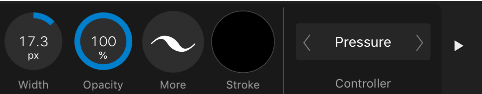
These are the brush tool settings I used. Firstly, the controller needs to be set to ‘pressure’ (for some reason this has to be done every time I open the app - quite annoying) - it gives you the lovely variable width using the Apple Pencil.
I set the windows stabiliser to 30. It feels just about right when I am using it.

Clicking on the 'more' button takes you to the 'size variance' setting. I stick it onto 100% as so:

Something else that I did early on was to delete all of the existing brushes and stick with one basic brush⁴:

I renamed it as you can see, but it's the basic default solid brush.
C. I went further and converted a huge mural into vector format.
Here is a mini snapshot of the finished mural design in question:

Originally drawn as a bitmap raster piece in Clip Studio Paint. It was big enough to work at scale, but vectors would be waaaaay better.
And here is a detail from it:

And an even closer detail:

Look: rasterisation!
Once I had completed the re-inking the vectorised result was sent to the printers as a CMYK hi-res PDF. The result was a very clean super-sharp image:

Trust me - it looks terrific.
Working through this was surprisingly straight forward - and I discovered a couple of extra techniques along the way that are going to be useful going forward:
Creating a 'parent' blank vector layer first will mean that all of your strokes end up automatically grouped from that point on. Arranging and keeping a grip of all of your layers is really hard to do once you have thousands of layers knocking about. (I also noticed that if you nest everything in this way, the brush pen responds more quickly).
An eraser layer. This is a HUGE thing. After creating a parent group for all of my ink marks to be dumped into, I then figured out that if you create a similar blank group WITHIN the parent inking group like so...

...and change the mode to ‘erase’ you effectively get a layer that can be used to carve out and erase/sharpen up any messily inked lines.

I usually change the name of the layer to 'erase' just to keep everything clear while I am working.
I’m not entirely sure that this screenshot does this justice, but the principle is a very powerful one - to be able to carve out aspects of your inking with an editable erase tool is a hugely powerful feature.
So after this I decided to have a go at creating something from scratch.
D. A meditation on Psalm 63
Taking some notes I had scribbled into my sketchbook from a church meeting I started to doodle and create some visual ideas. If you look carefully at this image you will see an initial attempt to structure the image around some geometric shapes.

Sketchbooks are the best.
I then created a similar layout using shapes and the alignment/layout tools in Affinity Designer on my Mac:

I exported this as a jpeg and began to draft some ideas in Clip Studio Paint (I prefer the way the pencils work here and am able to lose myself in the drafting/erasing/thinking process).

Then I applied all of the above and created a final piece:

There's a typo here somewhere.
E. Using a Mac and an iPad are the best of both worlds
As was said before - the taming of the vector beast on that far horizon requires considerable resolve and energy. If you are fortunate enough to possess both a big-screen Mac and an iPad you have the opportunity to muscle-in from both directions.
The weakness of the Mac - it’s input method is more than compensated for with the iPad Pro/Apple Pencil. The weakness of the iPad - it’s interface and organisation of huge numbers of layers - is very ably dealt with on the Mac. For this reason I have been using the 'open from Cloud’ function throughout.

Each time you save it, you can just pick up where you left off on the other platform. Simples.
Each platform in isolation can be frustrating, but taken together you have a brilliant context for making some gorgeous artwork.
F. Finally a few thoughts about Artboards
The Artboards function is another aspect of the software that I almost missed - to my loss. Two projects I completed in the last week or so (yes I have been busy) have made good use of the Artboard feature.
The first was for a series of images for an educational blog that I contribute to. If you look at the screenshot here you can see the ‘all art in one go’ Artboard at the top left. I used this for laying out the material in a logical arrangement once I had drawn it.

Then I broke the panels into moments and gave each a discrete Artboard. I applied final presets to each and did a batch export. It was both useful for arranging the material and creating a final set of shareable results simply.
The final example is from a series of tweets I illustrated last week. In a similar way to the example above, I used the Artboard function to create a spread of pages in a way that was meaningfully laid out. I was able to make something easily and export in the same way.

One of the great benefits of using Clip Studio Paint is the ‘story’ multi-page creation feature. If I am illustrating a book with 40+ images I usually give up on something like Procreate because it becomes such a chore churning out pages one by one. Multi-page creation is the way to go, and CSP has it sorted.
The Artboard feature on Affinity Designer goes one further than this by allowing you to arrange the pages however you want on the same screen. I love this feature and have already used it to save lots of time arranging an upcoming book project.
My main anxiety with using software like this is that when I am investing so much time into it - will it be dependable? Will it output reliably? The answer so far is pretty good - this will change the way I work permanently.
(Edited 13/1/2020 - this post is toooo long by half)
¹ I think about this quite a lot - there is a sweet spot for all great artists where expression is effectively minimal - doing just enough without overworking things. The best tools go at the speed of your decision making - if something occurs to you, ideally you should be able to change it there and then RAPIDLY. If the tools slow you down or snuff out those sparks of creativity then something is probably wrong. Perhaps you need to spend more time with a biro and scraps of paper and less time on a computer?
² This is probably why Procreate is so (rightly) popular as an app - you can just get stuck in. Vectors on the other hand usually take some thinking - how you organise your material, how you manage the tools etc. It can feel quite the opposite of creativity at times, so somehow you need to build those more fluid stages in BEFORE you get there.
³ This was about a month before the iPad version was released.
⁴ Yeah man I am badass. Actually I honestly think that limiting your choices is probably a better thing long term. "Creativity thrives within intelligent constraints" - John Maeda.