For a long time I have been obsessed with sketch notes.
Throughout my many lessons in various schools this was often a primary mode of communication: as I explained something to the class I would usually reach for a pen and start drawing something on the board. Words alone weren’t enough - often the combination of a visual summary would make the difference to a student really grasping what I was trying to say.¹
Another feature of this mode (which is surprisingly easy to forget) is the development of those notes in time. At the start of the explanation there are less marks on the board - as the explanation progresses, these fill out and create a more dense picture (duh). But as basic as this sounds, it is easy to forget - especially when you hand someone the final set of notes that make perfect sense to anyone who sat through the class - but are utterly baffling to anyone who wasn’t there for the ride through time.

This made sense as I drew it while listening to a podcast, but coming to it cold it can feel a little overwhelming.
Animated sketch notes occupy a uniquely privileged niche here: they enable the learner to digest material without overdoing things cognitively. An explanation unfolding in time is notoriously hard to get right, but if it can be mastered it absolutely rocks as a member of the online teacher’s toolkit.
The Highest Standard
When the awesome team at Cognitive started going viral online with their RSA collaborations there was a simple reason why: animated sketch notes are a powerful teaching tool and they had figured out how to do it really well. Here is a prime example from 2016. It combines a brilliant explanation of Economics with an incredibly complex set of illustrations that are animated expertly by what must have been a very well paid and hardworking team.
Faced with examples like this it is easy to feel more that a little intimidated, but I have been fortunate to have had the opportunity in my freelance and daytime work to develop my own approach and style.
Early Steps
The presentation below was a slideshow created using Clip Studio drawings and Keynote. It does the job simply with a sequence of images in time, supporting the lecture summary.
After this I explored more complex ways of expressing imagery and created this proof of concept. This was one of my first successful steps into using Apple Motion. For this video below I mainly combined screen-captured hand drawings, text-animations and write-on behaviours for lines. I wanted to break the static-slide mould.
The Midway Point…
From here I had the opportunity to create something a lot more adventurous - a short piece about the practice of teaching Religion and Worldviews for the RE Council.
The thing that was particularly satisfying about this piece was that I got to interview several talented teachers who really knew their stuff. Working with voiceover and soundtrack artists was also a lot of fun. I loved that this was a significant step closer to the style I had imagined myself reaching. The animation itself consists primarily of screen-captured drawings (using Procreate I think) and some crude masking which to be honest I wasn’t completely happy with (or sure of) at the time.
From here I continued the adventure with a personal piece that tries to capture how I make Biryani. There were steps forward but I was also struggling with how to control lots of elements effectively on screen.
I had begun to experiment with animating hand drawn masks instead of drawing everything in real-time. It enabled a bit more control but I was still finding myself somewhat confused at times as the walls of the software began to crowd in on me. Either way it was a win for the Indian-cuisine-animating sketch-note community.
A Functioning Toolkit?
Thankfully, in the last month or so I have at last figured out how to animate discrete elements in a way that feels like a more assured conclusion to this process.
In January I created a short film that functions as an announcement for several research projects being undertaken in the Crosslands Cultivate programme. The short excerpt below combines drawn imagery with an edited voice recording I made after conducting an interview on zoom.
In a similar vein, here is another excerpt from something I made this week: a personal response to a lovely book by David I. Smith which really feeds into the idea of creating hospitable learning experiences.
The book felt important enough to share and I want to extend my confidence with this emerging toolkit.
Both of the pieces embedded above are examples of something which finally feels like a re-usable toolkit - or visual language - that I can control with reasonable success.
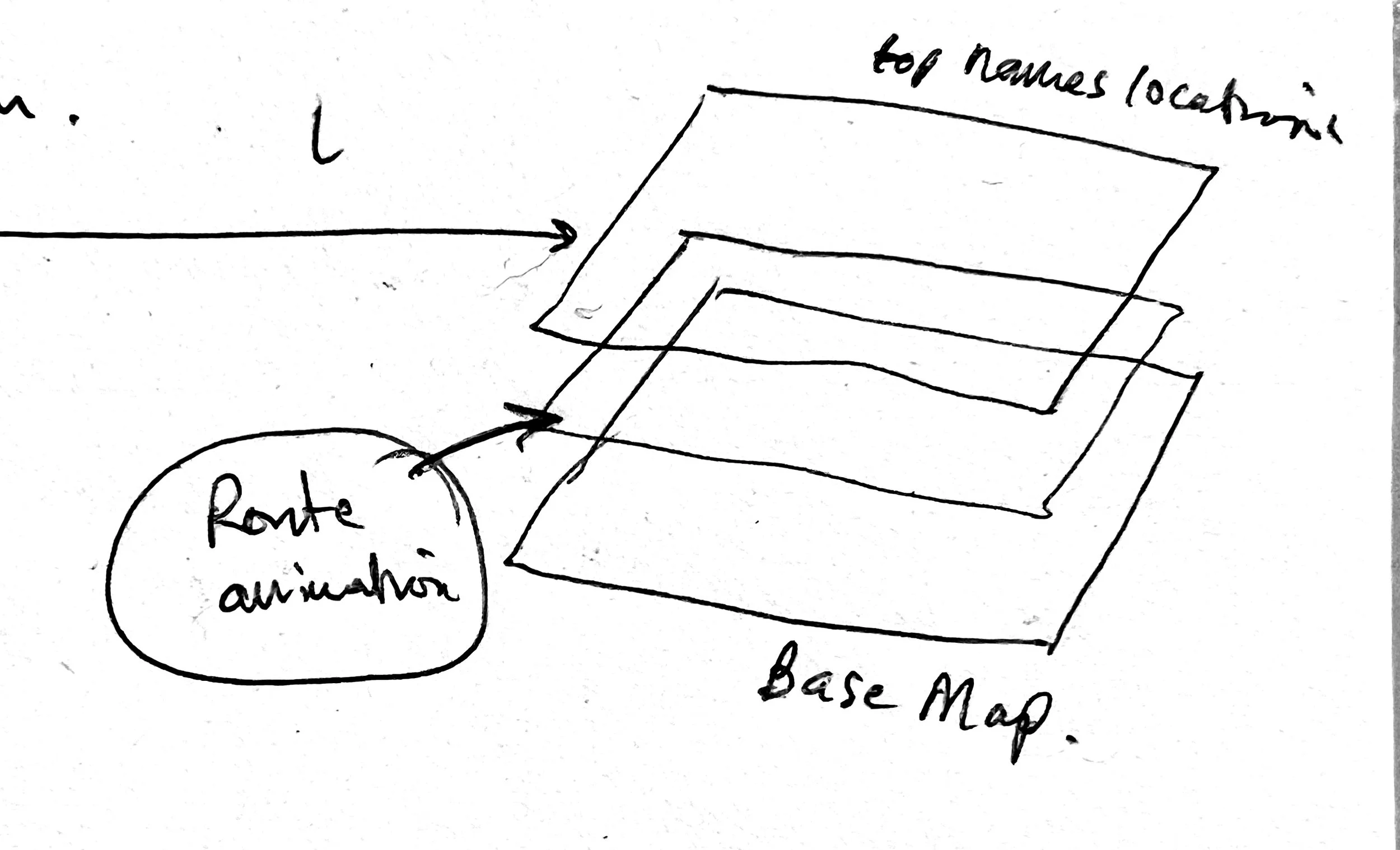
Part of this victory comes down to figuring out how to nest discrete stages/elements within groups, getting the correct blend-modes in place and animating masks for carefully-separated drawn chapters.
In the early days of using digital tools - and Apple Motion especially - I would often turn up with the best intentions and end up feeling utterly depressed as the inputs weren’t matching the outputs. The last two pieces feel like something has changed.
Process notes (for the nerds who got this far)
1. Source material gathered/digested/assimilated
this might mean reading something and summarising it with visuals/text, interviewing people and editing the audio. Having a carefully curated and succinct audio track
Tools I might usually use include Freeform, good old paper and pen, Notability, TextEdit/Runestone,
2. Rough animatic
something that simply combines sound, visuals and timing so you can have a feel for what is or isn’t working
Tools I might usually use include Ferrite on an iPad and then FCPX.
3. More careful visuals drawn
I refine my ideas throughout but this seems to be one of the most important steps because I have a clearer feel for timing and space as I skim back and forth across the rough animatic.
Clip Studio Paint is my main tool for any drawing. Using their (proprietary) Vector tools are useful purely because I can endlessly export assets at any size without losing quality. This is why mastering animated masks is a better approach than using iPad-drawn screen-captures because you are always limited to the size of the screen and your ability to draw it almost perfectly.
4. Animation basics
I convert my drawings into layered files which are then carefully animated. This process usually focusses on two aspects - the virtual camera and the images placed on a canvas. I sometimes create an animated version with still images that ONLY animates the virtual camera so I can feel how the screen will move. This has proven to be a superb drafting approach.
Apple Motion is the tool of choice here. Taking my images out of a Clip Studio master file I can save them as .psd files within the app and then these can be imported directly within Motion as nested folders. When I discovered this it was a kind of dream come true - organisationally this means that I take extra care (once I have drawn everything) in Clip Studio to isolate and label vector elements depending on where and when they appear. Otherwise you are just trying to manage endlessly complex pieces of a nightmare jigsaw puzzle.
5. Soundtrack refining
At this point I will usually revisit my soundtrack - once the animating has begun you usually bump into timing issues - sometimes it is obvious that certain parts need to breathe more and this is the time to fix that.
I use FCPX and (sadly) YouTube Studio for rights-free music to avoid copyright headaches further down the line - unless theres a budget or if I happen to become friends with Hans Zimmer.
6. Final animation
By now I know what I am doing and it’s a matter of lego-blocks over many many hours. Actually there are some moments where I might invest some special energy into little additional flourishes.
Conclusion
Faced with the intimidation of the RSA giants it can be tempting to lose heart and hide in the corner. My perspective on this is to be grateful for the opportunity to develop - especially within the Crosslands team over the last year or so - and to focus on the specific opportunities that I can collaborate with. I love that I have been able to work on some terrific projects and help communicate ideas which are worth sharing.
¹Even today I find myself reaching for a pen when I want to explain something to someone (maybe I am a lost, institutionalised cause).